The Finish of Platinum 3776 Century Fountain Pen
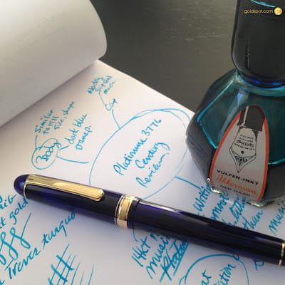
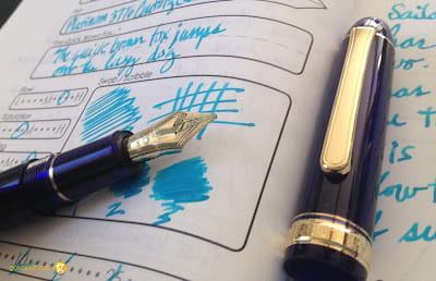
The 3776 Century "Chartres blue" takes its name from the deep, translucent blue stained glass of France's Chartres Cathedral. Designated a World Heritage site in 1979, the stained glasses are known worldwide for their beauty. Although the material is translucent, this pen is not a demonstrator. The body and cap have a high opacity, allowing only an aura of light to pass through, radiating a deep, royal blue. It isn't possible to see the ink level inside the pen's converter. You can somewhat make out the nib's silhouette inside the cap when it is closed. This characteristic is often considered when comparing the platinum 3776 vs sailor 1911, as enthusiasts debate the merits of each brand's design and functionality. Personally, I love the gold trim on blue pens. Most pen makers put silver or rhodium trim. Platinum recently released a rhodium trim version of the Chartres Blue, but I do prefer the gold, as it is more unique and beautiful. The thick cap ring with engraving, paired with a thinner ring above, creates an elegant point of interest on what would otherwise be a plain, cigar-shaped pen design. The oblong clip is also quite plain, lacking the distinctiveness and personality that other brands have utilized in their identity (Lamy Safari's wire clip, Visconti's arc clip & Pelikan's beak, for example).


